BigData - Tableau
BigData - Tableau
Overview
Basic Data Concepts
Data Source
Field
Qualitative fields (Dimensions):
- Describes or categorizes data
- Tells you what, when, or who
- Slices the quantitative data
Quantitative fields (Measures):
- Numerical data
- Provides the measurement for qualitative category
- Can be used in calculations
Fields in Tableau
When Tableau connected to this data set, it assigned the fields to either Dimensions or Measures.
- The qualitative fields that describe categories of data are in the top part of the pane, under Dimensions.
- The quantitative fields that measure categories of data are in the bottom part of the pane, under Measures.
Row level record: row of data is more detailed, or, granular, than in the first data set.
Data granularity: refers to the level of detail for a piece of data
Common Chart Types
Visual analytics leverages our pre‑attentive attributes – visual cues humans process automatically with sensory memory.
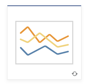
Line — View trends in data over time. Examples: Stock price change over a five-year period or website page views during a month.
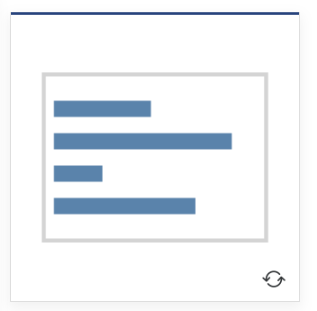
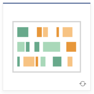
Bar — Compare data across categories. Examples: Volume of shirts in different sizes, or percent of spending by department.
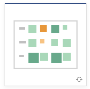
Heat Map — Show the relationship between two factors. Examples: Segment analysis of target market, or sales leads by individual rep.
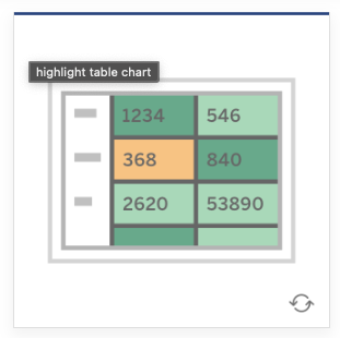
Highlight Table — Shows detailed information on heat maps. Examples: The percent of a market for different segments, or sales numbers in a region.
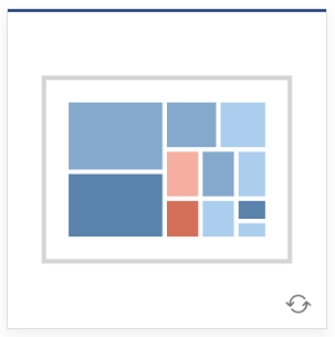
Treemap — Show hierarchical data as a proportion of a whole. Examples: Storage usage across computer machines, comparing fiscal budgets between years.
Gantt — Show duration over time. Examples: Project timeline, duration of a machine’s use, availability of players on a team.
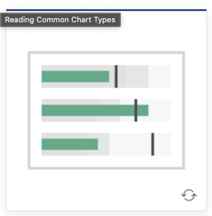
Bullet — Evaluate performance of a metric against a goal. Examples: Sales quota assessment, performance spectrum (great/good/poor).
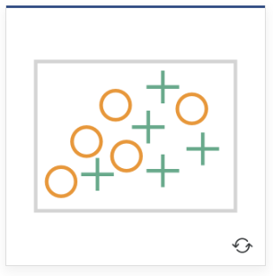
Scatterplot — Investigate relationships between quantitative values. Examples: Male versus female likelihood of having lung cancer at different ages, or technology early adopters’ and laggards’ purchase patterns of smart phones.
- Use scatter plots to determine correlation between two measures.
- Correlation refers to a relationship between two or more things.
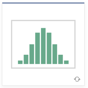
Histogram — Understand the distribution of your data. Examples: Number of customers by company size, student performance on an exam, frequency of a product defect.
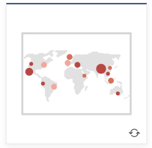
Symbol maps — Use for totals rather than rates. Be careful, as small differences will be hard to see. Examples: Number of customers in different geographies.
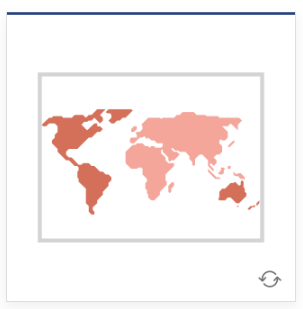
Area maps — Use for rates rather than totals. Use sensible base geography. Examples: Rates of internet-usage in certain geographies, house prices in different neighborhoods.
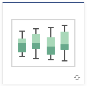
Box-and-Whisker — Show the distribution of a set of the data. Examples: Understanding your data at a glance, seeing how data is skewed towards one end, identifying outliers in your data.
Tableau Prep Builder
Preferred option for data preparation when consistency and repeatability is a requirement and there are dedicated user roles responsible for curating data for others to use.
Tableau Prep Builder also offers more sophisticated data preparation capabilities beyond Tableau Desktop when advanced transformations are required.
Best choice for when data needs to be cleaned and combined, when you need to do multiple reshaping, combining or cleaning operations to build a data source.
Tableau Prep Builder allows you to profile and explore your data before analysis.
Comments powered by Disqus.